 Sweden is pretty big on dairy products. I've already posted photos of cows here, so you already knew that. What you might not know is that Sweden has a kind of dairy product that I'm not sure if it exists anywhere outside of Scandinavia, since I can't find a good translation for it. The closest I've come is "soured milk," but that sounds disgusting. So as to not upset any sensitive stomachs, I'll call it "fil" [feel], which is the Swedish name.
Fil is fermented milk, like yoghurt. I'm guessing that the difference lies in which bacterial cultures are involved in the fermentation process. Wikipedia backs me up on that, so I guess I'm right.
Apparently, a lot of Swedes enjoy pouring cereal in a bowl, and then pour milk in so that all the cereal goes completely gooey and unedible. Not me. I pour fil in my bowl, and the thick consistency can hold the cereal I pour on top. The result: Crunchy goodness, mine for the eating!
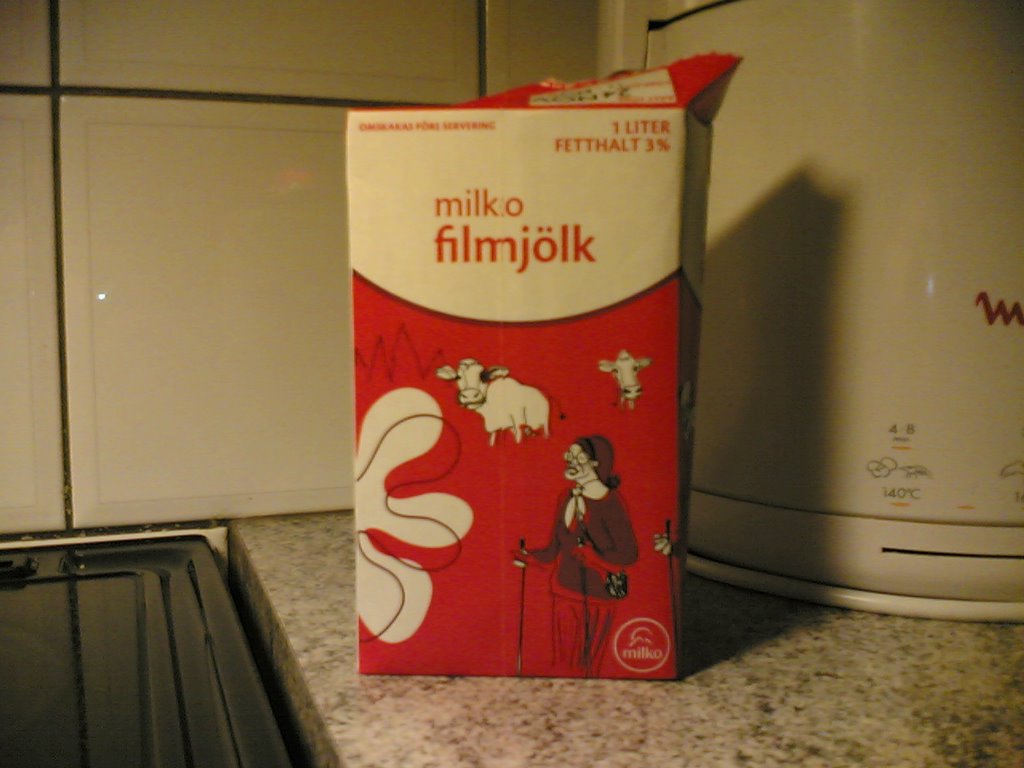
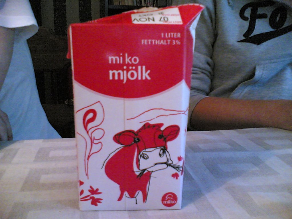 Now that you know what fil is, let's talk about the packaging. Above photo depicts a fil package. The photo next to this paragraph depicts a milk package. Fil packages used to be blue, which set them apart from milk with simple and effective colour coding. As of a few months ago, the two dairy products look very much alike. This can and has caused confusion, e.g. unwary people pouring fil in their coffee or splashing milk all over themselves, expecting the much thicker consistency of fil.
OK, maybe I'm exaggerating a bit, although mix-ups have happened. Now, from seeing only the front of these packages, you may get the impression that it can't be all that bad. After all, the red & white fields are inverted on the milk package. Telling them apart is easy as pie, right?
Well, let's take this once-in-a-lifetime opportunity to observe the dairy packages in their natural habitat.
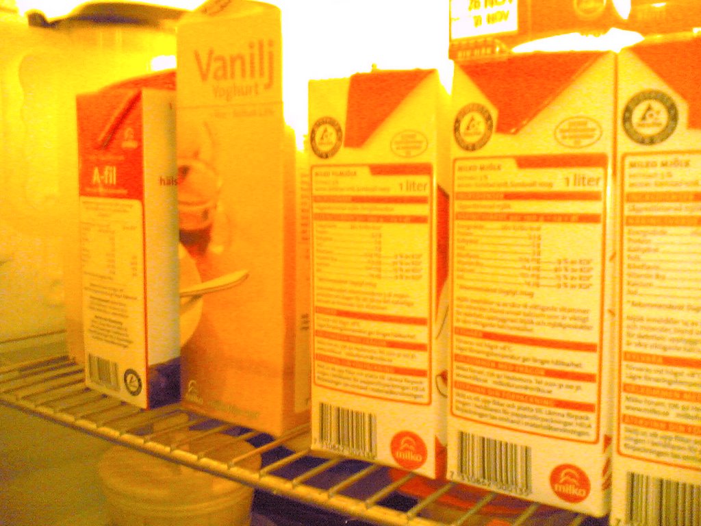 You'll notice that the "spines" of the packages are very very much alike. Can you even tell them apart fully awake? If you can't, that's the fil package in the middle, with the subtle red & white flap at the top. The same flap on the milk packages is just red. Brilliant. Imagine that you're half awake, bleary-eyed and foggy-headed, straight out of bed (y'all betta make way). Of course you'll get the wrong dairy product every once in a while! Who's the dumbass who actually thought this idiotic redesign would be a good idea?! Gaaaah!
4 comments:
OH NO!! WHY?! :O Fil should be fil, and milk milk. Sheeps sheep sheep?
Apparently they thought colour coding by fat percentage was more fun than colour coding by product. So now there's a fil for every level of fat: Red (normal 4%), green (medium) and light blue (light). At least I think there's a green; I've never seen one (but I haven't looked).
According to store clerks, older people sometimes come to the cash register with fil instead of milk and vice versa. It's gone as far as people not even knowing what they're buying. :P
That different level fats thing is stupid. Everybody should eat and drink red. The elderly probably aren't interested in fat levels anyway.
Hey wait, why is it red? There's nothing wrong with that fat level. Why is the light one blue? There's no blue in traffic lights. Unless you count green. That colour coding is obviously flawed.
Well, they already used yellow for "mini milk", the disgusting white water. The epitome of stupid fat levels. :)
And personally, I think red is more of a "buy me!" colour, than a "don't drink!" colour.
Post a Comment